Brand Identity · Visual Branding
Tootie Fruity — Spiked Punch
Beverage branding with confident type and high-energy color.
- Year
- 2025
- Disciplines
- Brand Identity, Visual Branding
01 · Overview
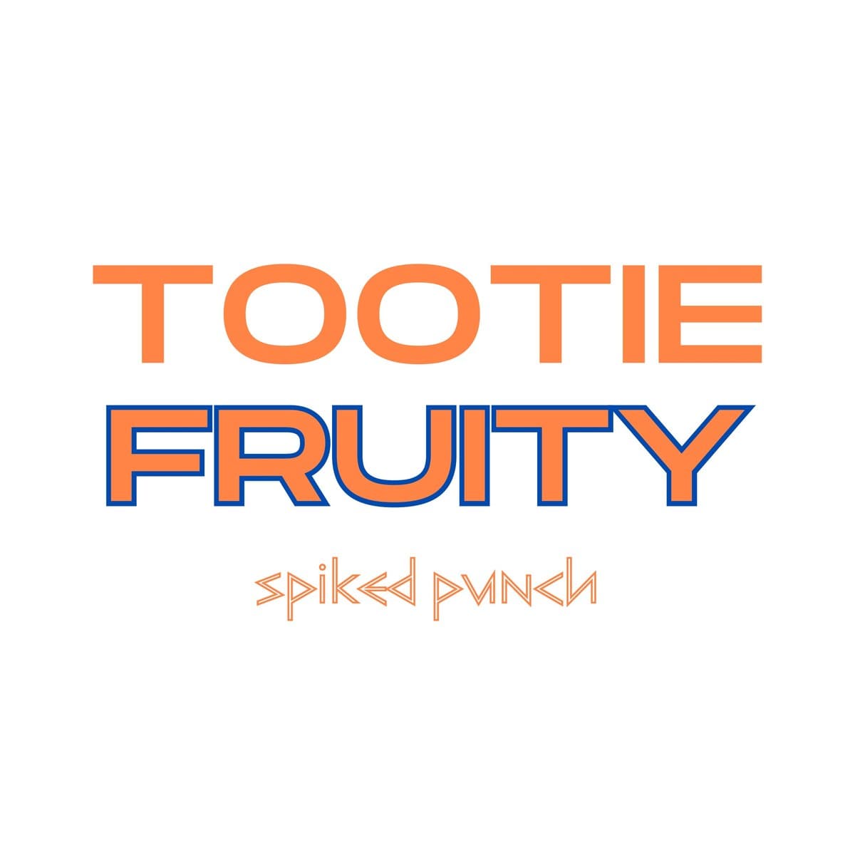
Tootie Fruity is a spiked punch brand that needed to pop on a shelf and in a feed. The work delivered a bold, type-led identity with high-energy color built for a fun, social product.
02
Challenge
Ready-to-drink beverages live or die on shelf presence and personality. The brand needed to feel playful and unmistakable without tipping into childish — confident enough for an adult product.
03
Approach
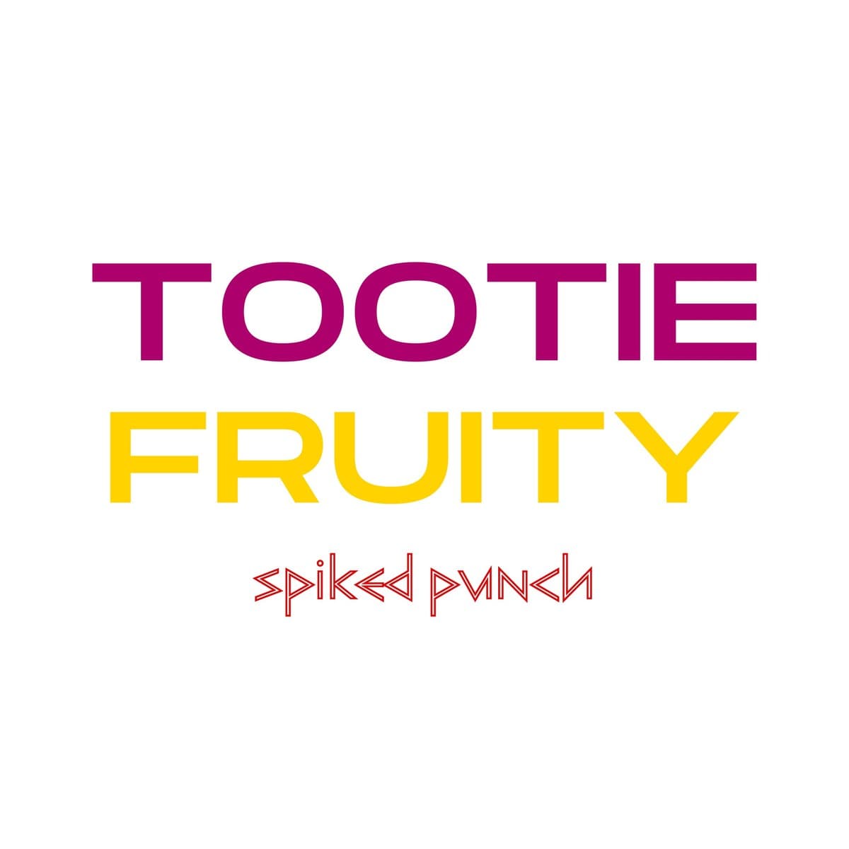
Oversized, punchy typography as the hero, an electric orange-and-blue palette with a pink-and-yellow alternate, and a distinctive secondary script for product naming. The system was designed to scale from can to campaign.
04
Outcome
A beverage identity with genuine shelf presence and a personality that translates instantly to social — distinct, energetic, and ownable.
Palette
#f47b3e
#1d4ed8
#b0107a
#f4c800
Next project