Brand Identity · Visual Direction · Digital
Brock & Anchor
A property management firm rebuilt as a quiet luxury brand.
- Year
- 2026
- Disciplines
- Brand Identity, Visual Direction, Digital
01 · Overview
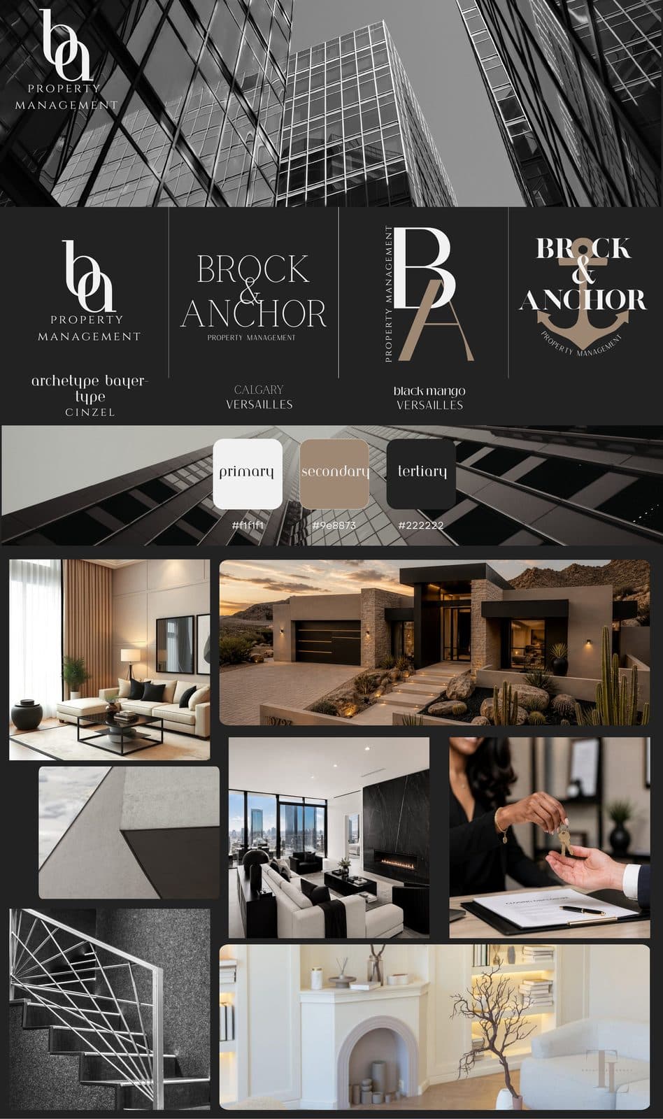
Brock & Anchor is a property management firm that wanted to be seen the way its portfolio looks — high-end, considered, and built to last. The brief was to move them away from the generic, utilitarian look of most property management companies and toward something that felt like quiet luxury.
02
Challenge
Property management is a crowded, undifferentiated category. Most competitors look interchangeable — stock photos, blue logos, a sense of the purely functional. Brock & Anchor needed an identity that signaled trust and elevation without losing the clarity a service business depends on.
03
Approach
A high-contrast serif logotype anchored by a refined monogram, paired with a restrained palette of architectural neutrals — bone, black, and warm taupe. The system was applied across digital, signage, business collateral, and a full social presence built on modern architecture and luxury interiors.
04
Outcome
A cohesive brand world that reads as established and premium. The identity now extends cleanly across every touchpoint — from the website to the owner portal to printed agreements — giving the firm a consistent, recognizable presence in a category where most blend together.
Palette
#f1f1f1
#9e8873
#222222
#0a0a0a

Next project